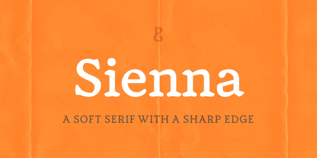
About Sienna Font
Sienna is a beautifully elegant and soft serif typeface designed for both text and display purposes.
Its soft and sharp structure creates an unusual, yet pleasing appearance. This leads to a comfortable reading experience with enough personality to create impactful titles and headlines, and Sienna will really shine in your branding projects.
Variable versions of the fonts are available allowing you to fine tune the weight to your exact liking. Small Caps are included (along with their matching diacritics) – adding another layer of versatility to this typeface. Proportional Lining figures are an option if you prefer them to the default Old Style figures. A number of swash alternates enhance Sienna, giving you the opportunity to add more flair and personality to your title and branding designs. Simply activate Stylistic Sets to start adding flourishes to your typography.
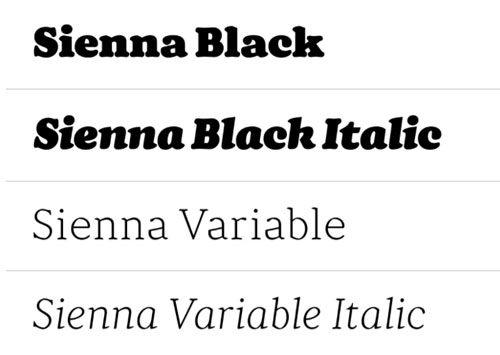
There are 14 fonts altogether, with 7 weights in roman and italic from Thin to Black styles. Sienna has an extensive character set (800+ glyphs) that covers every Latin European language.
Sienna Font Family
Below is a list of the complete font family from Sienna Font.
Sienna Thin
Sienna Thin Italic
Sienna Light
Sienna Light Italic
Sienna Regular
Sienna Italic
Sienna Medium
Sienna Medium Italic
Sienna Bold
Sienna Bold Italic
Sienna Heavy
Sienna Heavy Italic
Sienna Black
Sienna Black Italic
Sienna Variable
Sienna Variable Italic
See the whole font family here.
Sienna Font Family Preview

Key Features of Sienna Font
- 7 weights in both roman and italic
- Variable fonts included with full family
- 59 Alternates
- 8 Ligatures
- Small Caps
- Full European character set (Latin only)
- 800+ glyphs per font.
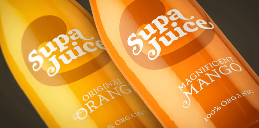
Uses for Sienna Font
Sienna is an excellent font for branding, advertising and packaging creative projects.
Who designed the Sienna Font?
Sienna font was designed by Paulo Goode, a talented designer from Ireland. He has designed many fonts over the years such as Torus, Cream and Audacious.

Paulo is a type designer with a long history of technical illustration. He’s a talented graphic designer by trade as well as being deep into website design & development.
His type design career began in 1998, although at the time he didn’t realise that was the case. He was designing a corporate identity and his chosen proposal featured a Trajan-esque typeface. He actually hand drawn it for the client. For many years after he had a nagging thought that “there’s something about that type”. He had a deep and unfulfilled passion for it. So, at the end of 2014, he found the inspiration to dig the original files out and create a complete font. People liked it and started buying it. From thereon he has continued to design typefaces.