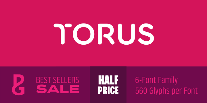
What is the Torus font?
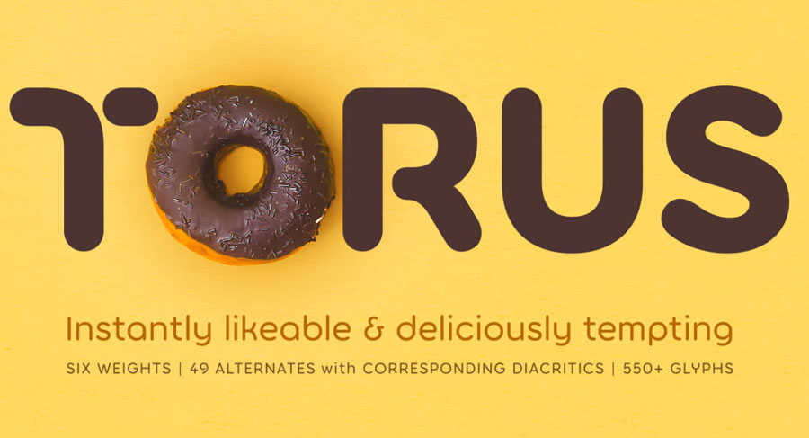
Torus is a simple, rounded monoline typeface that has been designed specifically for logo design, headlines and branding purposes. While the default character set is distinctive in its own right, graphic designers will love playing with the numerous alternate glyphs that will help them create unique wordmarks and logo designs.
Torus’ simplistic forms and soft terminals make this a lovely, warm typeface perfect for a multitude of typographic applications.
Please also take a look at Torus Variations – four additional styles to the Torus family.
Key Features of Torus Font
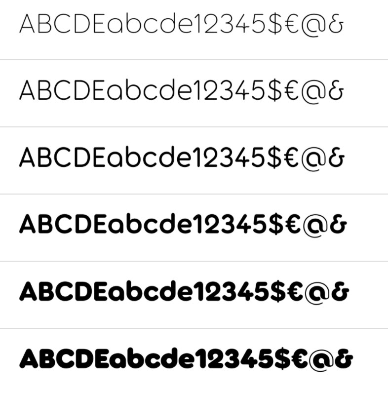
• 6 weights
• 49 Alternates (via 2 Stylistic Sets)
• Full European character set (Latin)
• 550+ glyphs per font.
Torus Font families
The Torus includes the following font families:
- Torus Thin
- Torus Light
- Torus Regular
- Torus Semi Bold
- Torus Bold
- Torus Heavy
Also check out Torus Variations and Torus Pro
Torus Preview
Here is a preview of how Torus will look. For more previews using your own text as an example, click here.
Who Designed The Torus Font?
Torus font was designed by Paulo Goode, a talented designer from Ireland. He has designed many fonts over the years such as Sienna, Cream and Audacious.

Paulo is a type designer with a long history of technical illustration. He’s a talented graphic designer by trade as well as being deep into website design & development.
His type design career began in 1998, although at the time he didn’t realise that was the case. He was designing a corporate identity and his chosen proposal featured a Trajan-esque typeface. He actually hand drawn it for the client. For many years after he had a nagging thought that “there’s something about that type”. He had a deep and unfulfilled passion for it. So, at the end of 2014, he found the inspiration to dig the original files out and create a complete font. People liked it and started buying it. From thereon he has continued to design typefaces.