
The Bern-based designer who goes by the moniker Bollo explains how collaborating with musicians enables him to go against the grain of accepted design norms.
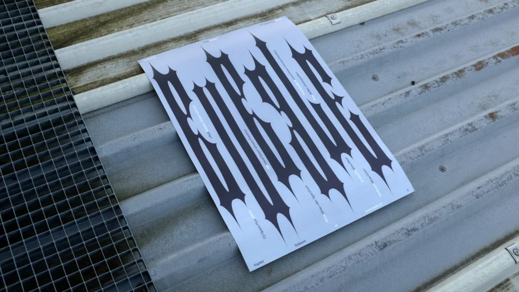
“I use typographic patterns with the intention to create rhythm”, says graphic designer Tobias Bolliger, “repetitive shapes followed by empty spaces generate variations of visual intensities.”
His style is defined by this experimental use of typography as well as the way the designer manipulates writing to produce shapes and forms. However, Tobias’ work also utilises a conceptual approach to “deform” typography, essentially rendering its fundamental function of legibility obsolete.
“By deforming typography as a carrier of information, new shapes are generated and the form is thereby pushed to the edge of its function.”
Tobias’ passion of “rhythm” spills over from his profession into the field he enjoys working in the most: the music business. Tobias enjoys creating music because it enables him to “combine the acoustic and visual domains,” and he works hard to make the sounds he is using recognisable. Additionally, Tobias considers music to be a space where design conventions can be broken and creativity can develop in a “unrestricted” fashion.

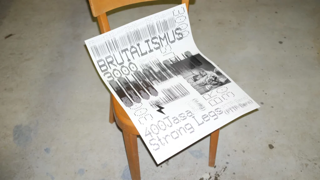
Tobias says that his poster for the Berlin-based Gabber duo Brutalismus 3000 is particularly representative of the way these ideas are expressed in his work. According to Tobias, “the concept of the poster centres around a very raw and gloomy aesthetic, similar to the duo’s identity.”
“The design is based on a barcode font, which consists only of horizontal lines.”
Bolder cuts are then generated to the point of distortion over a light cut version of the font, producing “diffused forms and black regions.” The result, a black and white poster with layers of competing sounds that are present throughout the music of the pair, is a wonderful representation of the layers of visual complexity created by repetition.
Growing up in Bern, Switzerland’s “beautiful” capital, Tobias had an early interest in drawing and graphics. He took an after-school session for design skill development when he was in school, and it was in this setting that he first learned about the area of graphic design.
Tobias afterwards worked as an intern in a Biel graphic design studio before continuing on to the Lucerne University of Applied Science and Art to get a BA in Graphic Design. Tobias developed his creative process while studying and came to adore “combining materials in a new light and staging them in free form.”
He continues, “A primary focus of my work now is to use the medium of graphic design itself as an art form, and to generate combinations from collected resources.”
Tobias has a few tangible projects in the works for the future, like branding IRMA Republic, a brand-new platform for artists to express their ideas. But Tobias’ main goal is to begin exploring new locations and nations in order to gather inspiration for his ongoing research into the typographic profession.