What is the Sutro™ font?
My affection for Slab Serifs began in the early 1960s in Kansas City with Rob Roy Kelly and his fabulous collection of wood type. In the 1970s tried to re-create a Nebiolo Egiziano for Roger Black. Again for Roger, in the 1980s I designed a Slab Serif logo for Newsweek Magazine. Finally, in 2003, designed the Sutro Family. There were things I didn’t like about it, so when I did Version 2 for Open Type, I changed it around a little, making it a much nicer Sutro.
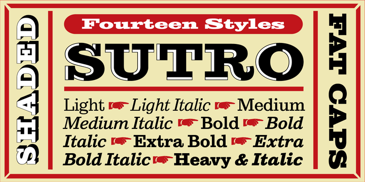
Sutro™ Font families
The Sutro™ includes the following font families:
- Sutro Light
- Sutro Light Italic
- Sutro Medium
- Sutro Medium Italic
- Sutro Bold
- Sutro Bold Italic
- Sutro ExtraBold
- Sutro ExtraBold Italic
- Sutro Heavy
- Sutro Heavy Italic
- Sutro Expanded Bold
- Sutro Black Initials
- Sutro Open Initials
- Sutro Open Fill
Sutro™ Preview
Here is a preview of how Sutro™ will look. For more previews using your own text as an example, click here.
