What is the Linotype Aspect™ font?
The letters in the Linotype Aspect Family fonts seem to be experiments in the handcrafting of letters with just a few basic geometric forms. For instance, the bowls of the letters C, D, and G in Linotype Aspect Intro are all made up of narrow half circles. Features like this make Linotype Aspect Intro perfectly suited for headlines and short passages of text. Its quirkiness is sure to lend a smile to the faces of your readers.
For shorter headlines with larger point sizes, try setting your text in Linotype Aspect Regular, the second member of the Linotype Aspect family. Linotype Aspect Regular uses the same basic letterforms as Linotype Aspect Intro, but reverses them out in white, and places them over bulbous black shapes. More…
The Linotype Aspect family was developed by German designs Hans-Jürgen Ellenberger in 1999.
Linotype Aspect™ Font families
The Linotype Aspect™ includes the following font families:
- Linotype Aspect Regular
- Linotype Aspect Intro
Linotype Aspect™ Preview
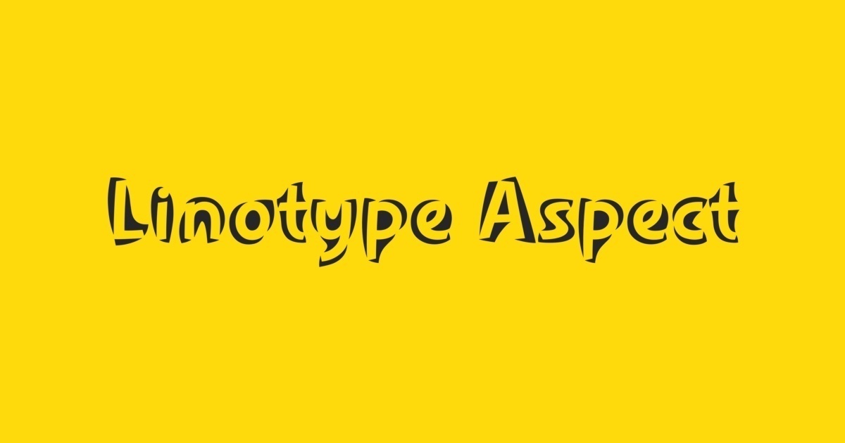
Here is a preview of how Linotype Aspect™ will look. For more previews using your own text as an example, click here.
