What is the Koch Antiqua® font?
Designed in 1922 by Rudolph Koch, one of the great lettering artists of the 20th century, Koch-Antiqua, also known as Locarno and Eve, has recently gained popularity among graphic designers and typographers.
This delicate display face has a small x-height, very tall ascenders, and main strokes that taper gracefully downward. The E, L, Z, and z have spurs on the serifs of their baseline strokes. When new, Koch-Antiqua was Koch’s most popular face outside of Germany, where blackletter types marked his success. Koch-Antiqua appeared extensively in advertising between the wars. More…
A refined letterform, it is best used sparingly for a distinctive look in advertising, book, and job work.
Koch Antiqua® Font families
The Koch Antiqua® includes the following font families:
- Koch Antiqua LT Std
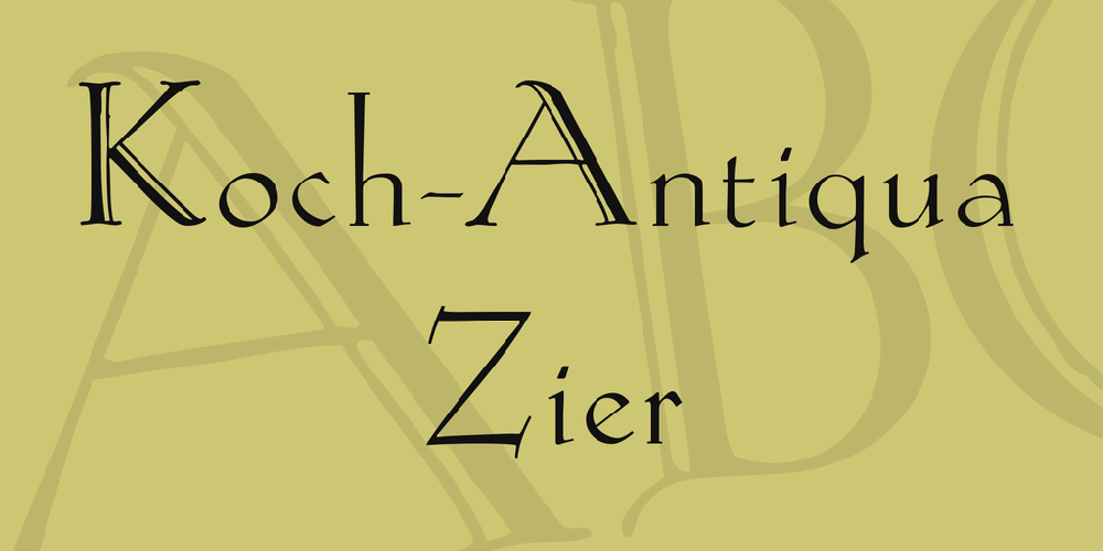
Koch Antiqua® Preview
Here is a preview of how Koch Antiqua® will look. For more previews using your own text as an example, click here.
