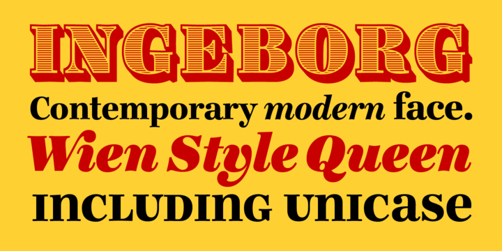
What is the Ingeborg™ font?
The Ingeborg family was designed with the intent of producing a readable modern face. Its roots might well be historic, but its approach is very contemporary.
Ingeborg’s Text Weights are functional and discreet. This was achieved without losing the classic characteristics of a Didone typeface, which are the vertical stress and the high contrast.
The Display Weights on the other hand are designed to fulfil their job and catch the reader’s eye by individual form language and a whole lot of ink on the paper. Nevertheless both are of one origin and work together in harmony.
Ingeborg™ Font families
The Ingeborg™ includes the following font families:
- Ingeborg Regular
- Ingeborg Italic
- Ingeborg Bold
- Ingeborg Bold Italic
- Ingeborg Heavy
- Ingeborg Heavy Italic
- Ingeborg Fat
- Ingeborg Fat Italic
- Ingeborg Block
Ingeborg™ Preview
Here is a preview of how Ingeborg™ will look. For more previews using your own text as an example, click here.