What is the Aspic™ font?
Asperity, Asphalt and Aspic, were designed for Another magazine issues 18 and 19, A typeface in three versions, Hard, Soft and Script, three typefaces with the same character shape, where hard is angular, Soft is brushlike, and Script a painted-ish connected design.
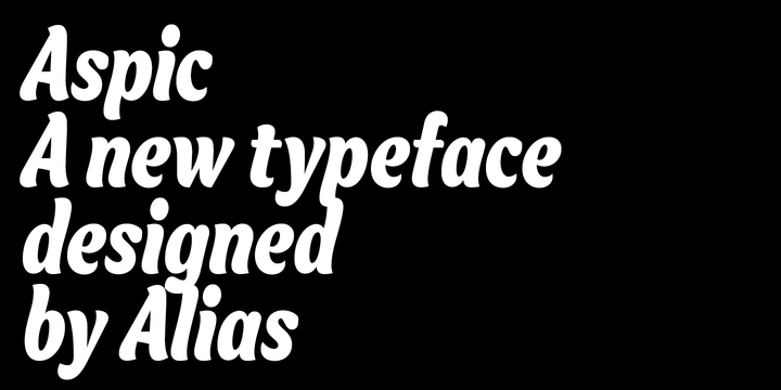
If Asperity references pen-drawn and carved lettering, Aspic has a different set of influences, but still based on crafted, calligraphic hand lettering. Aspic takes ideas from the lettering you might find on cereal packets or toilet rolls. Seemingly throwaway or ephemeral, these are skilfully drawn, crafted lettering designs, presumably brush-like and handwritten to signify friendliness, warmth. Aspic has that same swashy character, but is not overly informal. Rounded, but not hand-done.
Aspic™ Font families
The Aspic™ includes the following font families:
- Aspic Medium
- Aspic Bold
Aspic™ Preview
Here is a preview of how Aspic™ will look. For more previews using your own text as an example, click here.
