What is the Nolan Next font?
Nolan Next is a low-contrast humanist sans-serif with a large x-height and streamlined appearance. It is based on Nolan, but with a more compact letterforms and remastered curves. Designed to appeal to a broader audience due to its narrower width and subtle presence, Nolan Next is ideal for everyday usage. It is well suited for design applications ranging from branding and corporate identity to editorial and web design.
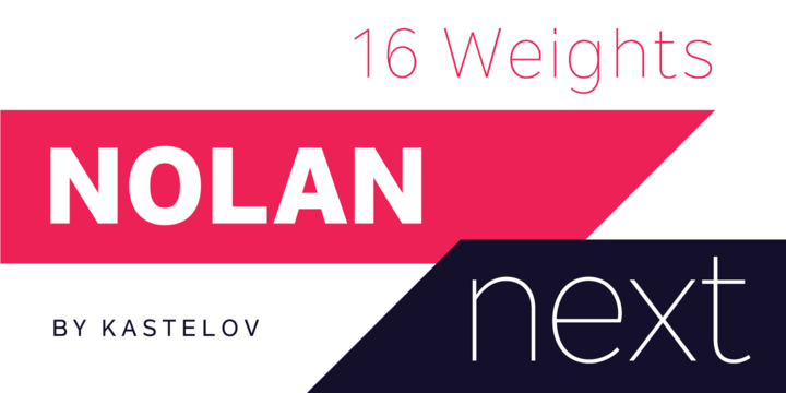
Comprising of eight weights with matching italics, Nolan Next is easy to work with and accommodating to your needs. Designed to work as a universal typeface, it also stands its ground in headlines, presentation materials, logotypes, etc. Additionally, the typeface includes an extended character set supporting an array of languages.
Nolan Next Font families
The Nolan Next includes the following font families:
- Nolan Next Thin
- Nolan Next Thin Italic
- Nolan Next Light
- Nolan Next Light Italic
- Nolan Next Book
- Nolan Next Book Italic
- Nolan Next Regular
- Nolan Next Italic
- Nolan Next Medium
- Nolan Next Medium Italic
- Nolan Next Bold
- Nolan Next Bold Italic
- Nolan Next Extra Bold
- Nolan Next Extra Bold Italic
- Nolan Next Heavy
- Nolan Next Heavy Italic
Nolan Next Preview
Here is a preview of how Nolan Next will look. For more previews using your own text as an example, click here.

Who designed Nolan Next font?
Nolan Next font was designed by Kastelov. His background is in corporate identity and branding. One approach that he tries to follow in the work that he does is his strive for subtlety and simplicity. The great Dieter Rams summed this up really well in his phrase “Less, but better”. The catch of course is that this is easier said than done, and it requires you to be more attentive and strategic about what is essential and what is not.
The other concept is that of the ‘golden mean’, first coined by Aristotle to judge and evaluate character in the people around us, but also applicable to producing any work of consistent value. In people, qualities such as courage, liberality, friendliness, wittiness and modesty are incidentally all attributes that a good typeface should posses. Kastelov find this relation both daunting and intriguing, but also a good base for exploring and developing typefaces that are timeless and universally appealing.
Kastelov is also the designer of the following fonts:
Axiforma
Nolan
Kinetika
Intelo
Nolan Next