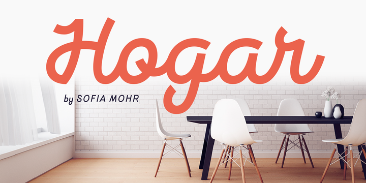
What is the Hogar font?
This font is the result of merging my architecture background and my love for typography, which inspired me to create a system of fonts based on interior architecture design, furniture design and, especially, the love I feel for my home.
The system comes with a monolinear style in sans and script versions, each including 5 weights, that share similar proportions, weight interpolation and details. Hogar is basically a sans with script gestures and a script with sans shapes. More…
In order to make the system more complete, I included an italic version, also in 5 weights, which represents a transition between both main styles. Additionally, I developed a set of monolinear dingbats including some furniture designs by well-known architects..
The family supports more than 200 Latin derived languages.
Hogar Font families
The Hogar includes the following font families:
- Hogar Extra Light
- Hogar Extra Light Italic
- Hogar Light
- Hogar Light Italic
- Hogar Regular
- Hogar Regular Italic
- Hogar Semi Bold
- Hogar Semi Bold Italic
- Hogar Bold
- Hogar Bold Italic
- Hogar Script Extra Light
- Hogar Script Light
- Hogar Script Regular
- Hogar Script Semi Bold
- Hogar Script Bold
- Hogar Dingbats
Hogar Preview
Here is a preview of how Hogar will look. For more previews using your own text as an example, click here.

Who Designed Hogar Font?
Seriguela font was designed by Sofia Mohr.

Her work inspiration is usually related to her personal experiences. Being Brazilian and living in a different country (Chile), has always pushed her in trying to rescue aspects of her own culture, allowing her to feel closer to her origins. It might be the aroma of an expresso coffee, or the wildlife of the amazon rainforest, even more personal experiences of Sofia’s childhood, that she tries to re-interpret through font design.
The first font she designed was Café Brasil, specially done as part of her font design diploma at the Universidad Católica de Chile.
This work was after selected as part of the 2014 Latin American typography biennial, receiving great feedback overall, motivating her to continue learning and consider font design as a full time profession.
Calligraphy has been an important part of her learning process, helping to incorporate a more personal touch to what she does. This method was specially important in fonts like Amazônia, Sofia’s first brush pen font, which required a wild organic stroke.
Other Fonts Designed by Sofia Mohr
Moranga
Mohr
Mangueira
Singolare
Águila
Anguita Sans
Mohr Rounded
Aromatica
Culinary
Hogar Slab
Amarela Stencil
Hogar
Café Brasil
Estampa Script
Cookery
Blauth
Nido
Amazônia
Amarga