What is the Got Milk font?
Got Milk? is from an American advertising campaign that was launched in 1993. The ad campaign’s aim was to get Americans to consume and use more cows milk. It was one of the most successful and well known advertising campaigns in the last twenty five years, which is why the Got Milk font logo attracts many designers to use the font that was produced for the ad campaign. It’s quite an iconic font and is actually a sans serif font the Phenix American.
In 2001, Monotype corporation released it for the first time. This sharp, modern, technical looking font was designed by Morris Fuller Benton.
It’s quite a condensed, clean and jaunty san serif which lends itself to being used for advertising, announcements and logos. The Got Milk font family has been widely used in many projects, designs and ad campaigns in the last 20 years. Its a solid, serious and dependable font.
Got Milk Font families
The Got Milk includes the following font families:
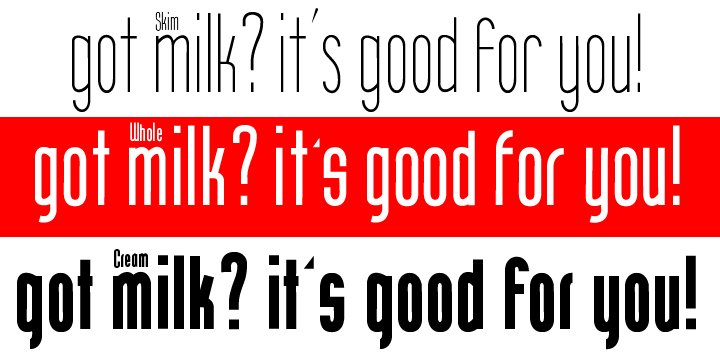
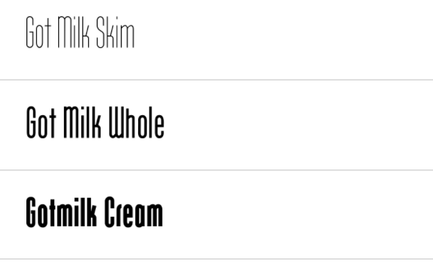
- Got Milk Skim
- Got Milk Whole
- Gotmilk Cream
Got Milk Preview
Here is a preview of how Got Milk will look. For more previews using your own text as an example, click here.

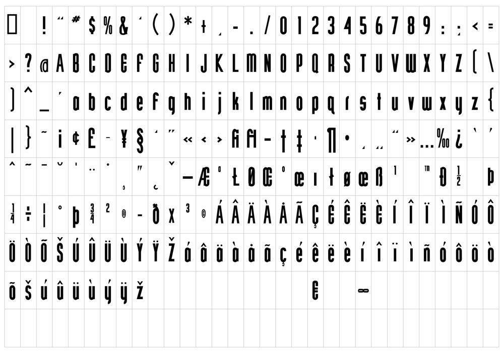
Got Milk Glyphs Preview
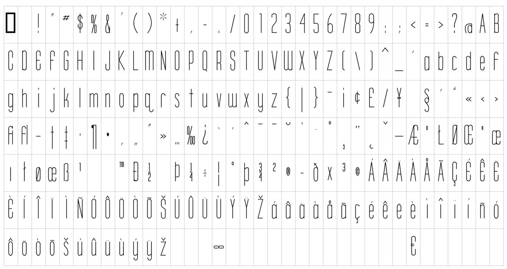
Got Milk Glyphs Slim
Got Milk Glyphs Whole